

.jpg)
A lot of Airbnb hosts treat the algorithm like a separate department.
Pricing lives over here. Operations live over there. Reviews get managed. Photos get taken.
Everything sits in its own little box.
Meanwhile, the platform is just watching behavior.
When someone scrolls, clicks, keeps scrolling, zooms in on a photo, books, or backs out, all of that becomes part of a pattern.
Over time, listings that keep people engaged get surfaced more often.
Listings that don’t create much reaction tend to hover in the middle of the pack.
That middle zone is familiar. Around 60–70% occupancy. Solid, but capped. Respectable, but not exciting.
Your listing's design feeds that pattern from the very first second.
Your cover photo sets the tone.
The first few images determine whether someone keeps exploring.
The layout, lighting, and clarity of the space influence how quickly a guest feels confident enough to book.
Then the actual experience of the home shapes the review they leave, which feeds right back into visibility.
It’s one continuous loop.
We’ve seen it play out repeatedly.
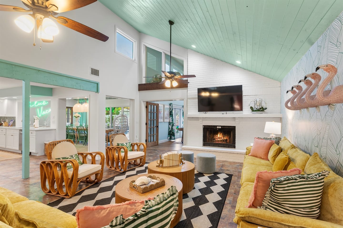
Take this Memphis property we designed.

We committed early to a bold direction.
Color, murals, strong visual anchors that read instantly on a phone screen.
It earned a Top 1% badge based on ratings, reviews, and reliability within months of launching.
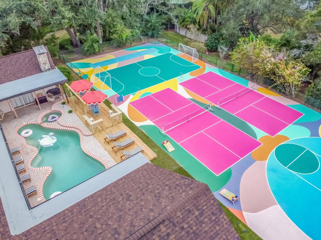
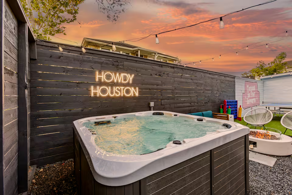
We've seen properties pull in $202,000 in future bookings within four weeks of going live.
Another locked in over $105,000 in three weeks.
.jpg)
.jpg)
.jpg)
.jpg)
These properties had a visual direction that was obvious from the first photo.
Those numbers reflect clarity. Guests understood what they were booking right away.
There was very little hesitation in the decision.
Why great photography can't save a boring space
Photography comes up in these conversations all the time.
Hosts invest in great photographers and expect the bookings to jump.
The photos look beautiful. The performance barely moves.
The problem is the space didn't give the photographer anything distinctive to capture.
A camera can make what you built look its best. It can't manufacture a reason to click where there isn't one.
If your living room looks like every other living room in your market, better lighting and a wider lens aren't going to fix that.
You're just getting a higher-resolution version of forgettable.
When a room has a clear point of view, like the Memphis dining space with its bold wallpaper and neon moment, it becomes recognizable.
The difference in click-through is immediate, because the cover photo finally has something worth clicking on.
That's conversion optimization with furniture.
Your reviews are shaped by design too
Airbnb's system now evaluates your photos and your guest experience together.
When there's a gap between what your listing promised and what guests walked into, that shows up in reviews.
And the algorithm notices.
Cleanliness scores get influenced by perception as much as actual operations. A cluttered, visually chaotic space feels less clean even when it's spotless.
Guests walk in, something registers as off, and that feeling shows up in their review.
On the other hand, a well-designed room that looks exactly like your photos reinforces trust the second they walk through the door.
They relax. They settle in. They leave a five-star review because the experience matched the expectation.
We've seen properties lose their Guest Favorites badge just because the gap between the photos and the actual space widened over time.
The algorithm doesn't care why. It just sees the scores dropping and starts showing your listing to fewer people.
Longer stays follow the same logic.
Airbnb loves extended bookings. Less turnover, fewer customer service headaches.
You can encourage them with discounts, but whether guests actually want to stay at your place for a week comes down to whether it's comfortable to live in.
A space designed purely to photograph well but uncomfortable after two days?
Guests either don't book the longer stay, or they do and mention in their review how beautiful everything was but how they wouldn't stay that long again. Neither outcome helps you.
When your space balances visual impact with real comfort—storage guests can actually use, a kitchen that functions, seating people want to sit in for more than a photo op—extended bookings become much easier to secure.
All of this feeds the same system.
When guests consistently book longer stays at your property and leave happy, you start showing up more often for people searching for week-long trips.
What this means if your listing feels stuck
If a listing feels stuck, the issue is often embedded in the space itself.
Your pricing is competitive. Your response time is fast. Your reviews are solid. But your occupancy won't budge past 65%, and your nightly rate feels capped.
In those cases, the design usually lacks clarity. The space may be fine. It simply doesn’t communicate strongly enough in the first few seconds.
The algorithm ranks response.
When clicks increase, bookings happen faster, and reviews feel enthusiastic, visibility follows.
Final thought
If your listing looks good on paper but performs flat in reality, there's a disconnect somewhere.
It's often something small having an outsized impact. The cover photo that's fine but totally forgettable. The layout that makes sense in person but photographs weird. The amenity that sounded promising but doesn’t change behavior.
We can usually spot it in about 15 minutes.
If you're thinking about upgrades and want to make sure you're spending money on the right things, we’re happy to take a look.
That conversation tends to be much more practical than people expect.
